


Here's a little process we've been working on perfecting and wanted to share: full wash letterpress cards.
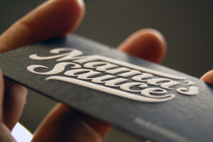
SEE: The new incarnation of the Mama's Sauce Business Card. 1-color black letterpress on 110# Florescent White Lettra duplexed to 140# Black Muscletone.
When you give the negative space in your design some room to breathe, surround it with enough coverage, and then build just the right counter you can really make a pillowy fluff that's somewhat like a hybrid emboss.
All of the white type is knocked out from the plate, which affords us the chance to put as much ink on the plate as we want. That coupled with just the right impression allows us to get near 100% opacity on the color wash and create an inverted effect from the standard letterpress deboss. Had there been positive text along with the knockout, it wouldn't be possible to get quality results on just one plate, as positive type can't be slathered with ink. Why can't we put as much ink on positive type as we do with knocked out? Science. We don't know the science. It just is.
Lesson to take from this: Big color washes belong on their own plates. You can knock type or imagery out of that plate/color and not affect opacity much, but don't even think about adding in positive area text or imagery on that plate/color unless you're willing to either sacrifice opacity overall or severely bleed out the positive images... Want solid washes and good clean positive type on the same color? Then be prepared to pay to plate the two separately. There's no wrong way to do it, I mean shoot, there's something to be said for lowering the opacity on certain wash areas. We just want you to be prepared and in the know.
Signed,
—J. Walter Weatherman